
In the dynamic world of web development, CSS selectors are foundational for styling HTML elements creatively. The arrival of the :has selector marked a significant shift, opening new styling possibilities that extend beyond traditional CSS capabilities. This feature, from the CSS Selectors Level 4 specification - called frequently as a parent-selector, allows developers to style elements based on their relationships with other elements, offering unprecedented specificity and dynamic options. It's a great tool for creating more visually structured pages and simpler responsive designs.
It was introduced some time ago, but due to the lack of compatibility with most browsers, using it didn't make much sense. However, over the last 3 years, this has significantly improved, and on December 19, 2023, Mozilla Firefox, the last of the major browsers, announced full support for this functionality starting with version 121.0 - giving us a long-awaited present.
In this article, we'll explore the :has selector, uncovering how to use it, highlighting a few practical use cases, and discussing if it's already the time to start integrating it into your projects.
Let's get started then!
How to use it?
We will begin with two straightforward examples to demonstrate its utility:
1. Styling a parent based on child content: Suppose you want to style a list item (<li>) only if it contains a link (<a>) within it. The :has selector makes this easy:
li:has(> a) {
  background-color: lightskyblue;
}
This CSS rule applies a lightskyblue background to any <li> element that directly contains an <a> element, making lists with links visually distinct.
2. Conditional styling based on the presence of an element: Imagine you have a <div> that should only have a border if it contains an image or a child element with a class .icon. With the :has selector, you can achieve this by:
div:has(img, .icon) {
  border: 2px solid green;
}
This rule will add a green border to any <div> that contains at least one <img> element or element with class of .icon, useful for highlighting sections of your page that contain visual content.
These examples illustrate how the :has selector enables more intuitive and context-sensitive styling, allowing for designs that adapt based on content structure.
Practical use case
In a specific web project scenario, there was a requirement to dynamically style a button, which is a preceding sibling of a div containing an input element. The goal was to make the button visible only if the input field contained a value. This functionality aimed to enhance the form's usability by clearly indicating to users that an action (e.g., form submission) is available only after filling in the required field.
Utilizing the :has selector in CSS provided an elegant solution to this challenge without the need to use JavaScript for style manipulation. Below is an example of the code that implements the described functionality:
/* Hiding the button when input is empty */
div:has(input:placeholder-shown) + button {
  visibility: hidden;
}

/* Making the button visible when input has a value */
div:has(input:not(:placeholder-shown)) + button {
  visibility: visible;
}
In this example, the button is styled based on the state of the <input> element located in the preceding <div>. The first CSS rule hides the button when the <input> is empty (i.e., displays the default placeholder text). The second rule makes the button visible when the input field contains a value (meaning the user has started typing, and the placeholder is no longer displayed).
This approach is particularly useful in interactive forms where the availability of certain actions (e.g., a "Next" or "Submit" button) depends on the user completing specific fields. By leveraging the :has selector, the clarity and usability of the user interface can be enhanced, regardless of the specific JavaScript framework or library used. This technique can be applied in e-commerce checkout forms, online surveys, or any web application where guiding the user through a step-by-step process improves overall experience.
Additional use case
Highlighting Empty Containers: Often, it's useful to visually indicate when a container is empty to prompt user action or for debugging purposes. With the :has selector, you can inversely target empty elements by styling those that do not have child elements:
div:not(:has(*)) {
  padding: 20px;
  border: 2px dashed blue;
  background-color: lightblue;
  text-align: center;
}
This CSS targets any <div> that does not contain any child elements (*), applying a dashed blue border and some padding, making it visibly clear when a container is empty.
With the :has selector, possible use cases are almost unlimited especially when you combine it with other css selectors. While its immediate advantages are clear, its full potential is still to be explored. In the coming years, people will surely find clever new use cases, pushing the boundaries of CSS to its new limits.
So far, so good. Are there any drawbacks then?
Browsers Compatibility
The ":has" selector isn't exactly a newcomer in CSS anymore, having been around for several years. However, its usage in professional projects has always been hampered by compatibility issues with major browsers. That recently changed when one of the latest versions of one of the big browsers (Mozilla Firefox) also started supporting this feature.
As we can see on the caniuse.com website, the :has selector is now supported by all the largest desktop browsers (Chrome/Edge/Safari/Firefox/Opera). Only Internet Explorer and some mobile browsers don't support this feature(yet?).
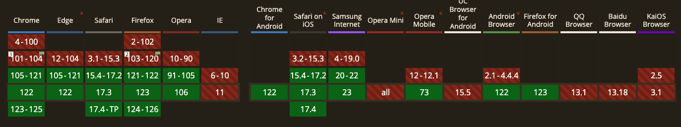
While this looks great for desktop browsers, let's consider the scenario where a user might be using the app on unsupported mobile browser or on an older version that doesn't support this feature yet. This could potentially cause significant visual layout disruptions.
How to handle that?
For such situation you should consider implementing fallback strategies for unsupported browsers. One way to do that are feature queries. Feature queries allow you to check if a specific CSS feature is supported by the browser. You can use this to apply a fallback style if the :has() selector is not supported. Here is a simple example:
/* This rule won't be applied in browsers that don't support :has() */

ul:has(> li li) {
  /* CSS applied when the :has(…) pseudo-class is supported */
}

@supports not selector(:has(a, b)) {
  /* Fallback for when :has() is unsupported */
  ul > li,
  ol > li {
    /* The above expanded for browsers that don't support :has(…) */
  }
}
There are also few other ways to handle that like using polyfills or a feature detection libraries like Modernizr but this is a larger topic for another time.
:has the time come?
The final question remains: Is it now the right time to use it in your project, or should you wait a bit longer?
As is common with non-obvious cases, the answer is - it depends.
On one hand, with recent adoption by Firefox, all major desktop browsers now support :has, offering a broader reach and enabling cleaner, more efficient code. Additionally, :has can enhance code maintainability by simplifying complex selectors, particularly beneficial for projects targeting modern browsers.
However, it's essential to acknowledge the limitations. Mobile browser support for :has remains limited, particularly among older browsers, potentially impacting a significant portion of your user base. Moreover, implementing fallback strategies for unsupported browsers adds complexity to the project.
Ultimately, your choice should be based on the specific requirements and timeline of your project, balancing the potential advantages with the practical considerations of implementation. Whether you decide to proceed now or postpone adoption for a later stage, thorough evaluation and testing will be key to ensuring a successful integration of this powerful selector into your development workflow.
Photo by rawpixel.com on
freepik.com